A pivot table is a great reporting tool that sorts and sums independent of the original
data layout in the spreadsheet. If you never used one, this demo may be of interest.
| Who | Week | What | Amount |
| Joe |
3 |
Beer | 18 |
| Beth | 4 | Food | 17 |
| Janet | 5 | Beer | 14 |
| Joe | 3 | Food | 12 |
| Joe | 4 | Beer | 19 |
| Janet | 5 | Car | 12 |
| Joe | 3 | Food | 19 |
| Beth | 4 | Beer | 15 |
| Janet | 5 | Beer | 19 |
| Joe | 3 | Car | 20 |
| Joe | 4 | Beer | 16 |
| Beth | 5 | Food | 12 |
| Beth | 3 | Beer | 16 |
| Joe | 4 | Food | 17 |
| Joe | 5 | Beer | 14 |
| Janet | 3 | Car | 19 |
| Joe | 4 | Food | 17 |
| Beth | 5 | Beer | 20 |
| Janet | 3 | Food | 18 |
| Joe | 4 | Beer | 14 |
| Joe | 5 | Food | 12 |
| Janet | 3 | Beer | 18 |
| Janet | 4 | Car | 17 |
| Janet | 5 | Food | 12 |
Add as many rows as you can stand -- around 50 will do.
Now choose any cell in this table and choose Pivot Table wizard in the Data menu. Excel
asks for the data source and suggests this table. Click OK.
Next question is the data range. Excel suggests the table. If you expect to add data in
the future, set the data range to include as many rows as you think you will ever need.
Rather than A1:D50, you may want to specify $A$1:$D$500.
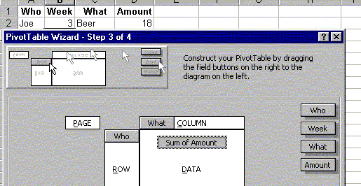
Now comes the layout wizard, show below.
Drag the headers Who, Week and What into the ROW area, and the Amount header into the Data area. (Leave the Column area blank for now.) If the Amount tag does not show "Sum of Amount", double-click it and choose the Sum option. Finally Excel asks if the table should be placed in a new worksheet. Click OK.
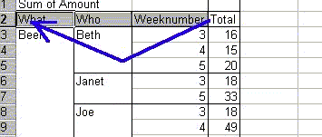
Now you have your table, and it looks very much like a sorted version of the original data list, except from the automatic subtotals. Now comes the cool stuff:
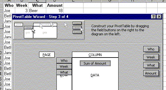
Grab the What header in the table and drag it all the way to the left.
When you drop it here, the table re-sorts and re-sums; you have a table of beer costs by
person instead. Now drag the Week header to the left and you have
a weekly report.
Double-clicking the headers gives options of showing/hiding specific data (like Empty and Beer, may come in handy) and removing subtotaling for this column. Right-clicking gives other options, among them Hide and Show Detail for reading totals only.